An awkward room usually reveals itself at the moment you try to place the first major piece. The sofa blocks a passage. The dining table feels stranded. A window, radiator, sloped ceiling, or off-center door seems to overrule every obvious layout. Learning how to furnish awkward rooms is not about finding clever filler pieces. It is about establishing a clear purpose, then building the room around proportions that serve it.
This is not decorating around a problem. It is design work. The room needs furniture that resolves its constraints rather than disguises them.
How to Furnish Awkward Rooms: Begin With the Room’s Job
Before measuring furniture, decide what the room is required to do. A narrow living room may need to host conversation and occasional guests. An underused dining room may need to become a place for meals, work, and family projects. A strange alcove may be the best location for a study, not a place to force another chair.
Many awkward rooms fail because they are asked to be too many things without any hierarchy. Give the room one primary job and, if necessary, one supporting function. That decision immediately clarifies what deserves the best floor area, natural light, and storage.
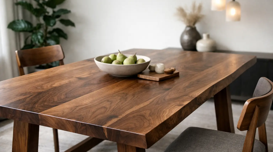
A home office, for example, should be organized around the work surface and sightlines from the chair, not around a decorative rug or a spare cabinet. In a dining room, the table is the governing element. Its size, shape, and placement determine circulation, lighting, rug dimensions, and where storage belongs.
When the largest function is settled first, the room stops feeling like a collection of compromises.
Measure the Architecture, Not Just the Floor
A simple length-and-width measurement is rarely enough. Awkward rooms are defined by the details that standard furniture ignores: door swings, baseboard heaters, window trim, ceiling slopes, radiator clearance, outlet locations, and the depth of a structural bump-out. Record every one of them.
Then map the routes people actually take. A room may technically accommodate a large sectional, but if every person entering must turn sideways around its arm, the piece is too large. Good circulation is not leftover space. It is a deliberate part of the plan.
As a working rule, preserve about 30 to 36 inches for primary walkways where possible. Tighter conditions can work in secondary areas, but they should feel intentional rather than accidental. Dining chairs need room to pull back. Desk drawers need room to open. Cabinet doors need clearance from nearby furniture.
Also measure vertically. A low ceiling can make a tall bookcase feel oppressive, while a high ceiling above a shallow room may require a substantial cabinet or built-in composition to give the space visual weight. The useful dimension is not simply what fits. It is what fits in proportion to the architecture.
Put One Strong Piece in Charge
Rooms become awkward when too many undersized pieces compete for authority. A small sofa, two small chairs, a narrow console, a random bookcase, and several decorative tables can make a difficult footprint feel even more fragmented.
Choose one primary furniture piece that answers the room’s central purpose, then let the rest support it. In a narrow sitting room, that may be a properly scaled sofa placed along the long wall. In a compact dining room, it may be an oval or rounded-rectangle table that preserves movement at the corners. In an entry, it may be a shallow, well-built cabinet that handles daily storage without projecting into the path.
The right dominant piece does not always sit against the longest wall. Sometimes floating a sofa creates a useful seating zone and improves the route through the room. Sometimes a desk belongs at a window, even if it means commissioning a lower, shallower profile than an off-the-shelf desk provides.
The trade-off is real: furniture that is sized precisely for the room may cost more than a quick retail purchase. But the alternative is often years of living around pieces that were never suited to the architecture.
Use Shape to Solve Circulation
Rectangular furniture is efficient to manufacture, which is why it dominates the market. It is not automatically the right answer for every room. In a space with diagonal traffic, tight corners, or an offset doorway, softened shapes can preserve valuable movement.
Round and oval tables are especially effective in compact dining areas because chairs can move around them more naturally. A rounded front edge on a custom desk can ease passage through a narrow study. A bench may fit beneath a window where dining chairs would create a constant obstacle.
That does not mean every difficult room needs curves. Straight lines can bring discipline to irregular architecture, particularly when a built-in cabinet or bookcase establishes a clean visual boundary. The question is whether the furniture shape supports how bodies move through the room.
Avoid choosing a shape only because it appears visually interesting. A dramatic curved sofa can consume more floor area than expected and create difficult gaps behind it. Every unusual silhouette should earn its place through function.
Treat Dead Corners as Useful Territory
The corner behind a door, the shallow space under a stair, and the wall interrupted by a window are often dismissed as unusable. They are usually just unsuitable for standard furniture.
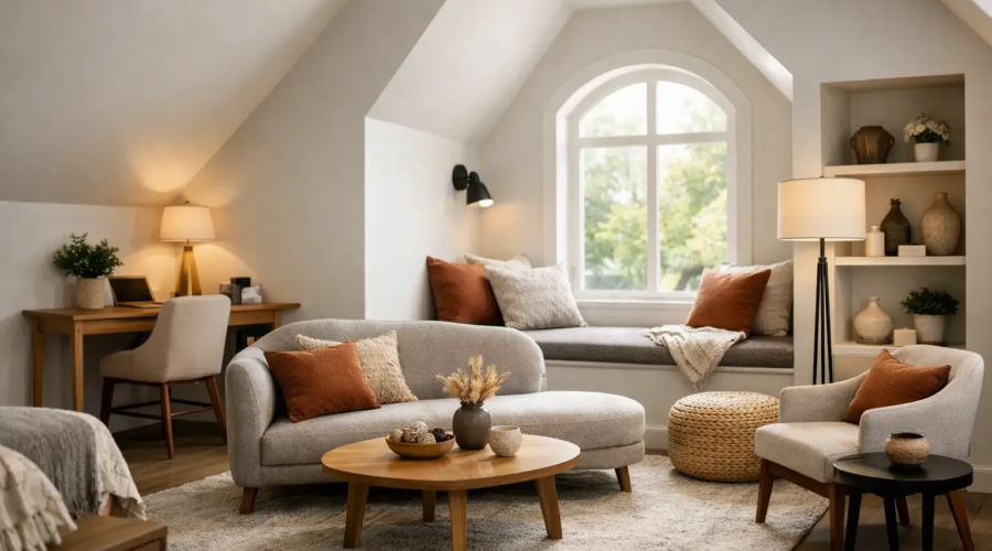
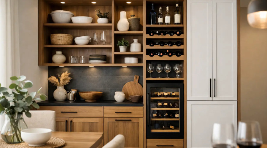
A dead corner can become closed storage for household items, a small writing surface, a display cabinet, or a reading perch with integrated drawers. Under a sloped ceiling, low cabinetry can turn a frustrating void into storage that feels built into the house rather than added after the fact.
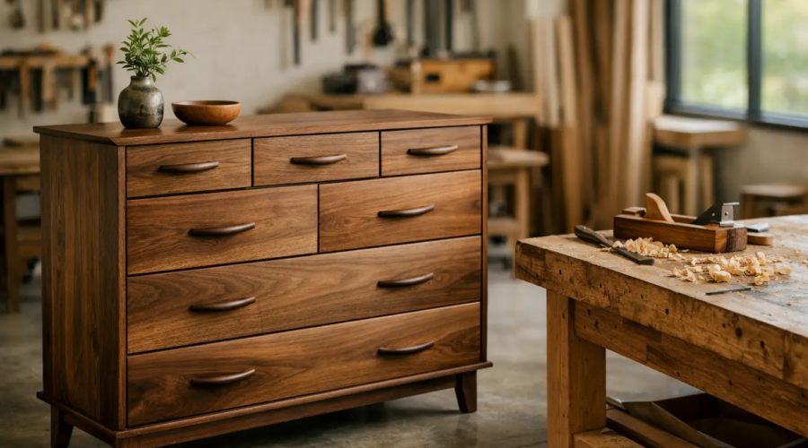
This is where custom work has a meaningful advantage. A cabinet can be designed around exact depth, height, and obstructions. It can continue a base line across an uneven wall, conceal necessary storage, and provide a substantial surface for lamps, art, or daily use. The result is not merely more capacity. It is a room that reads as resolved.
Open shelving is not always the answer. It can make an already complicated room feel busier, especially if it becomes a landing place for unrelated objects. Use open storage when the contents are genuinely worth seeing. Use closed storage when the room needs calm.
Build Storage Into the Furniture Plan
In an awkward room, storage should not arrive as an afterthought. It should be considered alongside seating, work surfaces, and dining capacity from the beginning.
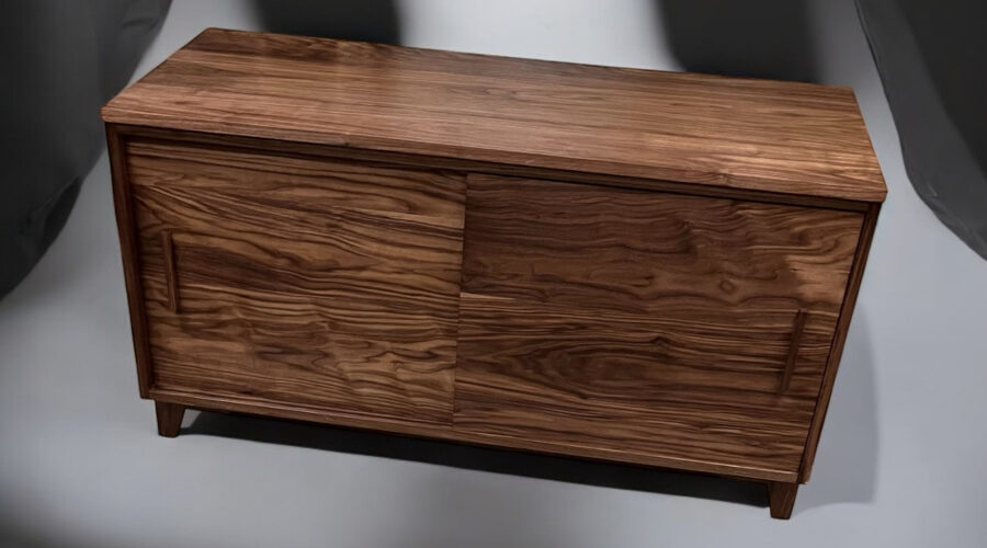
A well-designed credenza can store serving pieces while anchoring a dining room wall. A window seat can hold blankets, games, or seasonal items. A desk with properly planned drawers may eliminate the need for a separate filing cabinet. These pieces do more than reduce clutter. They prevent the room from accumulating the small, mismatched storage units that erode a clear layout.
Consider what needs to be stored, how frequently it is used, and whether it should remain visible. Daily-use items deserve the easiest access. Less frequent items can occupy deeper or lower cabinets. This practical hierarchy informs the dimensions, hardware, and internal organization of a piece.
A beautiful cabinet that cannot hold what the household actually owns is simply sculpture with doors.
Respect Windows, Doors, and Focal Points
An off-center window is not a command to force symmetry. Trying to balance every irregular wall with matching furniture often produces a staged, uncomfortable result. Instead, use the architecture honestly.
A long credenza can extend beyond an offset window and make the wall feel more composed. A built-in bookcase can frame a window while allowing its asymmetry to become part of a larger composition. In a room with multiple doors, resist placing furniture solely to create a perfect visual axis if it compromises movement.
Every room also needs a visual resting point. It may be a fireplace, a crafted cabinet, a view, a large piece of art, or a dining table beneath a well-proportioned light fixture. If the architecture offers no obvious focal point, furniture can create one. This is especially effective in generic bonus rooms and open-plan spaces where the walls provide little guidance.
Choose Fewer Materials, With More Discipline
Irregular spaces already ask the eye to process a great deal. Strong grain variation, too many finishes, and an assortment of unrelated furniture styles can make them feel unsettled.
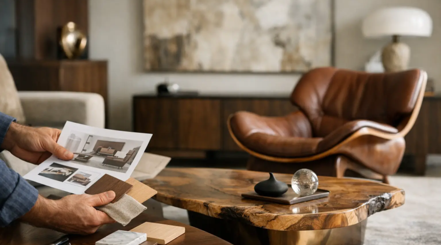
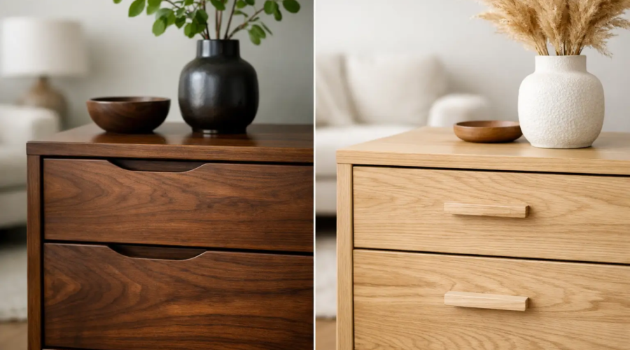
Use a restrained material palette to create continuity. That might mean one primary wood species across a desk, cabinet, and shelving, with variation in scale rather than color. It might mean warm painted cabinetry paired with a single wood table. The goal is not to make everything match. It is to ensure the room has a coherent visual structure.
Material choices should also reflect use. A family dining table needs a finish that can withstand daily meals and occasional repair. An entry cabinet benefits from durable hardware and a surface that tolerates keys, bags, and wet-weather routines. In the Pacific Northwest, where raincoats and muddy shoes are part of ordinary life, practical entry storage is not a luxury detail.
When Standard Furniture Is the Wrong Tool
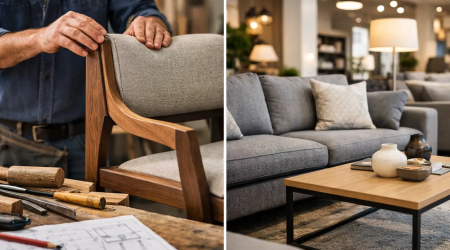
Retail furniture is useful when the room is straightforward and the required dimensions happen to exist. It is the wrong tool when a piece must meet three or four precise demands at once: a specific depth, a narrow clearance, meaningful storage, an unusual ceiling line, and a material relationship to the rest of the house.
Custom furniture does not need to fill every wall. In fact, overbuilding a room can make it feel rigid. The better approach is to identify the one or two pieces where exact proportion will change the entire plan. Often that is a built-in, a dining table, a desk, or a storage cabinet.
Start with the difficult decision, not the easy accessories. Once the furniture is sized to the room, the room begins to tell you what it needs next.